
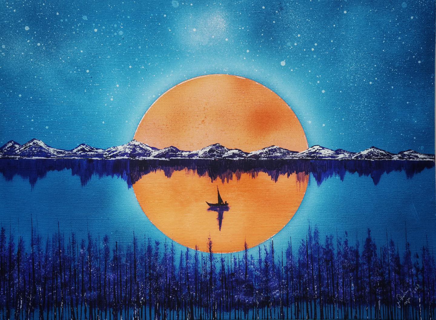
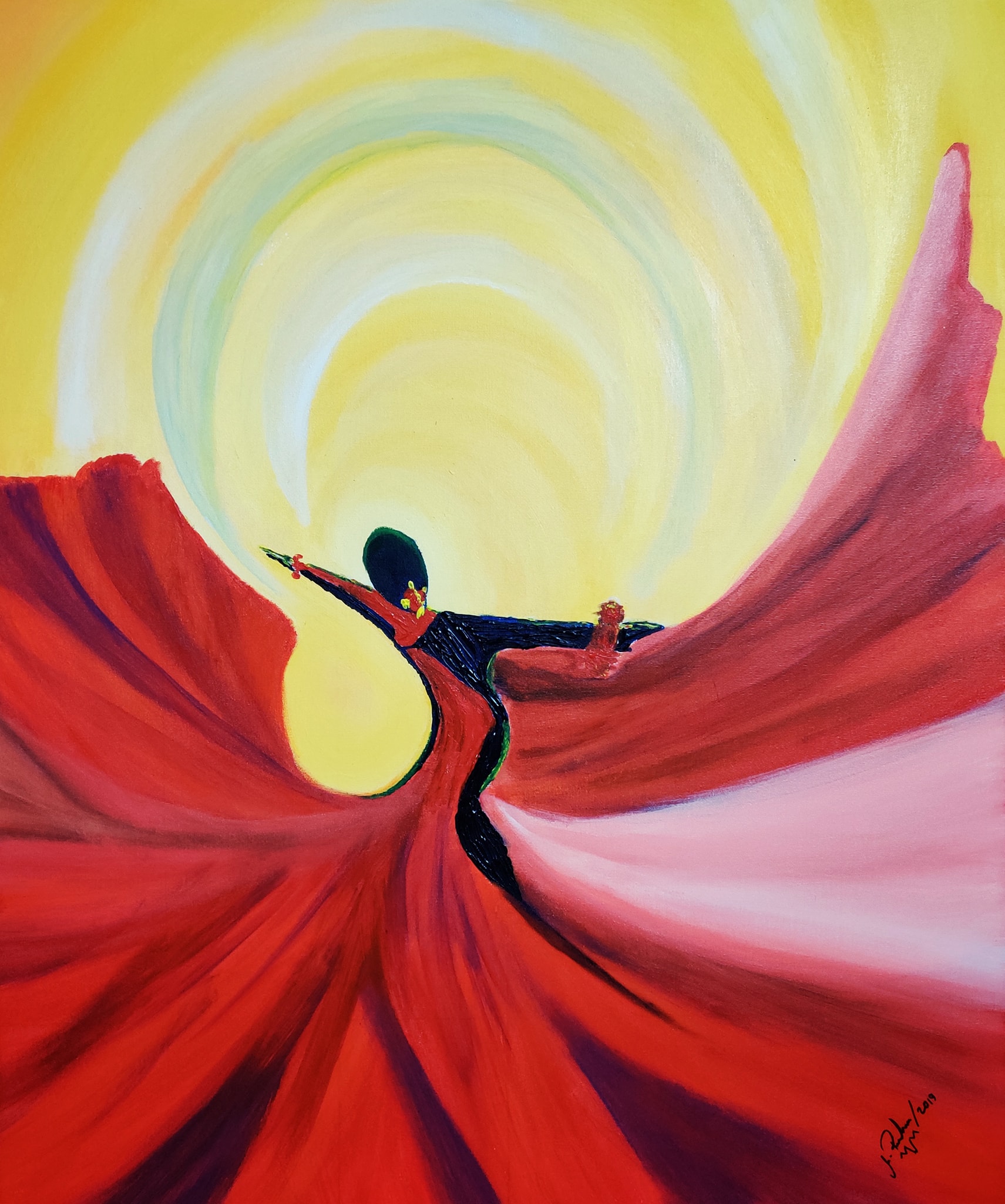
Balance
Symmetrical Balance
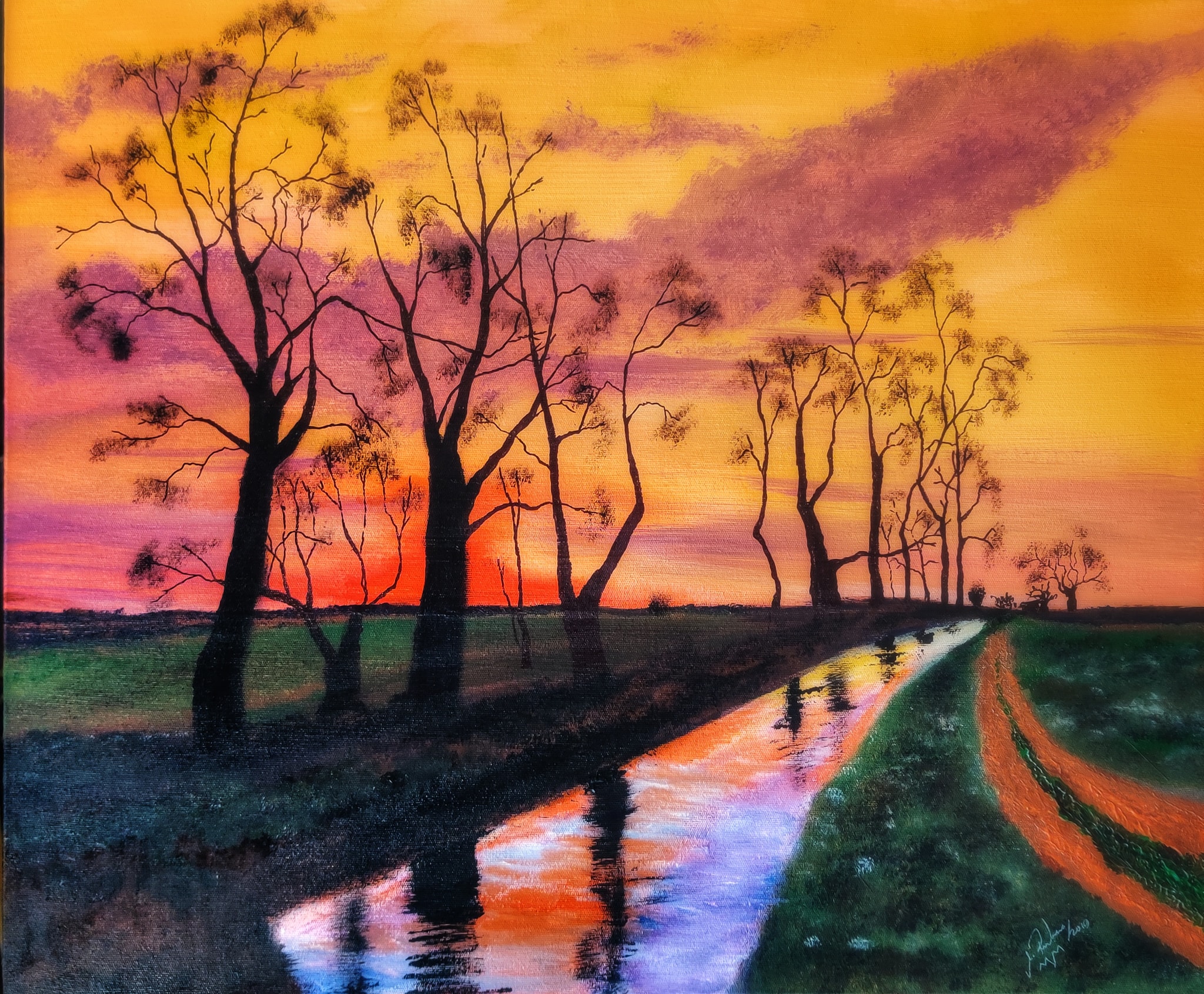
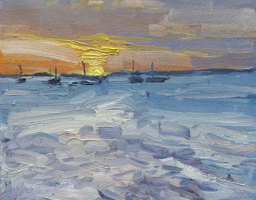
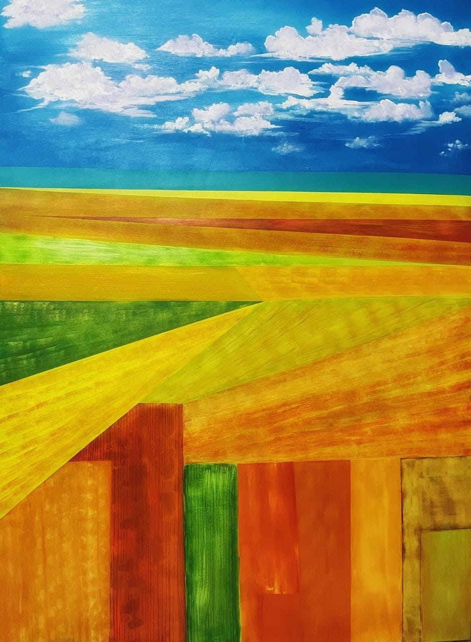
Contrast
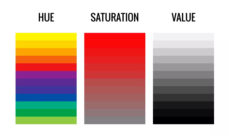
Value Contrast
Hue Contrast:
Saturation Contrast
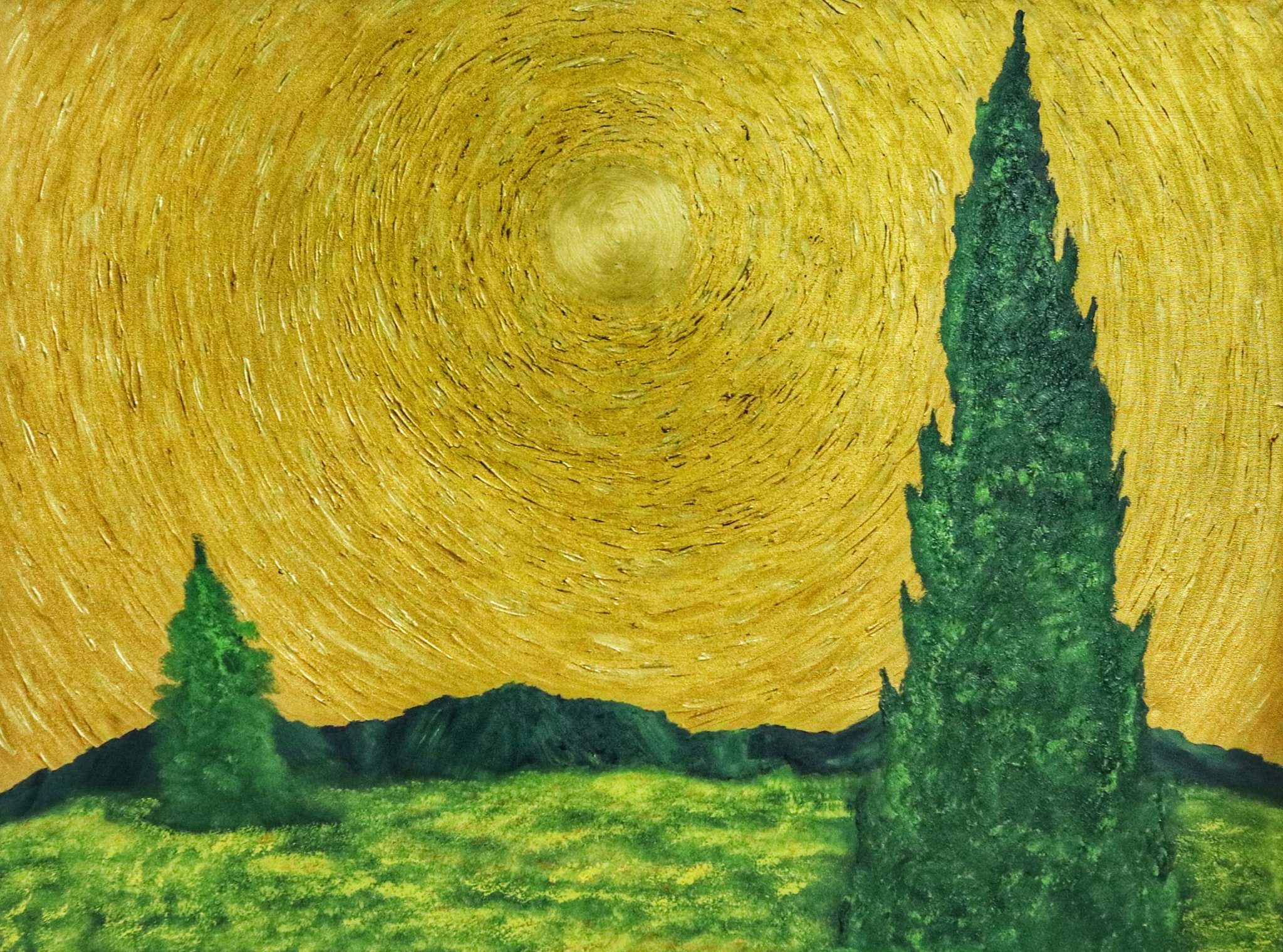
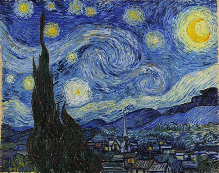
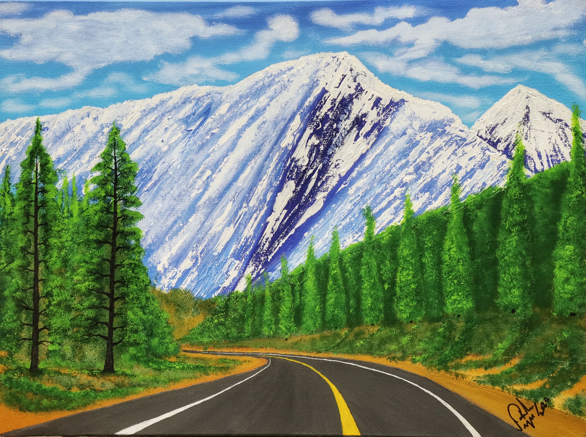
Motion or Movement
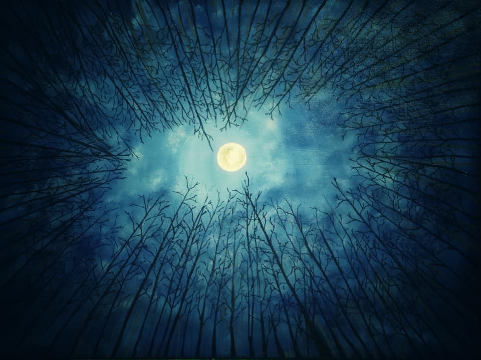
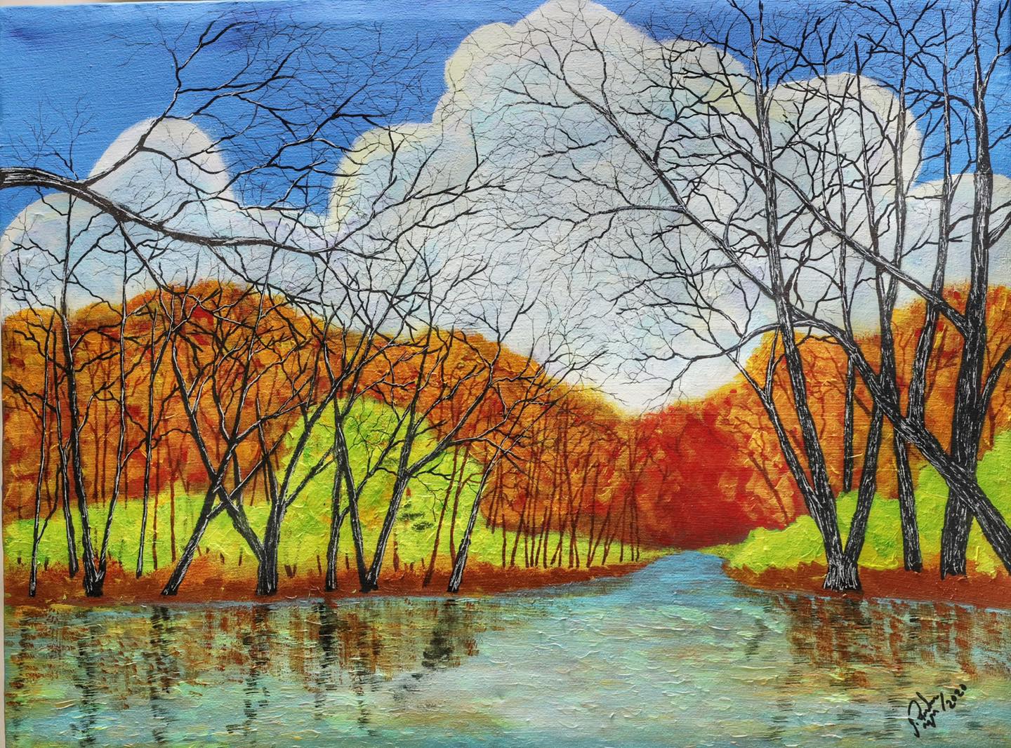
Pattern
Natural Pattern
Man-Made Pattern
Compositional Unity
Conceptual Unity
Gestalt Unity
Reference: http://johannansimb1001786mch206.blogspot.com/2013/02/balance.html
Https://drawpaintacademy.com/contrast/
Https://drawpaintacademy.com/emphasis/
Http://rscc2d.blogspot.com/2015/09/rhythm-and-movement-using-art-elements.html
Https://www.artyfactory.com/art_appreciation/visual-elements/pattern.html
Https://myranaito.medium.com/the-importance-of-proportion-in-art-a1f8d664f0f1
Https://www.paintingandartists.com/rhythm-in-drawing-and-painting
Register now to get updates on promotions and coupons.